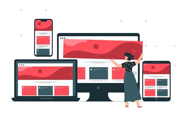
If you’re designing websites, make sure it is compatible with mobile phones, desktops, tablets, etc. Why so? Because it’s apparent people can either see it on their phones, desktop, or any displayable device. If your design does not match the expectation of your visitors, you are losing various profits.
So in this blog, we’re going to cover what responsive design is? And how to do it amazingly well? Please keep your eyes on it because we’re also going to talk about why companies or website owners should invest in making responsive designs.
Responsive design is kind of a buzzword that a lot of designers hear all the time. But some of them are not sure what it means and how to do it well. That’s something we all will be covering in this blog.
So, let’s get started.
Highlights of Contents
Why is Responsive Design Important in 2021 and the Coming Years?
There are a lot of terms going around responsive website design. There is a relatively short basic history behind it. I am pretty sure that you are very well aware of it. If not, let me give a little glimpse into it. The responsive design came when phones came out like smartphones came out in 2007.
Remember the days before mobile phones what happened is that it would just compress the whole website that was designed for the big screen, big horizontal screens and try to put them on the mobile phones. It looked like crap. You still have to zoom in and as funny as it sounds.
Many websites are still not responsive and when websites are always like that, and when you open them up on mobile. They are just horrible to read. It is hard to read when you have to zoom or scroll.
It’s not optimized for significant content consumption. When you are thinking about what your website should look like when it’s open on the phone.
There are a lot of things that need to change, like some layout, the text size. Make sure that the website looks well. Mobile design now as we go forward like in time. There are more devices, there are more platforms, so it’s not just tablets and mobile phones.
With just one side, there are almost all the sizes in between, and you have to make sure that your website looks great on all of them, which does our work.
Designer’s infinitely more challenging, so how do you go about thinking about them? Let’s get started with some key concepts that you need to understand before designing some websites.
What is a Responsive Website Design?
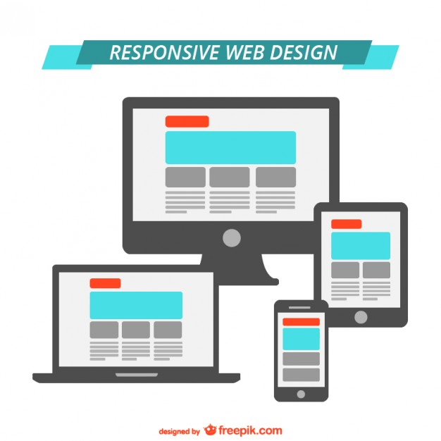
The responsive web design definition is the automatic adjustments of the front, images, style of a web page when displayed on the screen of desktop, tablets, smartphones, etc. In short, it is an ultimate solution for web pages to adapt to the screen sizes of any device.
Responsive website composition reacts to the clients’ device and gives a positive review and perusing experience. The site changes itself regarding size and goal, relying upon the gadget that you’re utilizing. So in case you’re using a phone, you’ll be seeing the mobile layout of the site where the text, style, and images are resized to fit the more modest screen. This way, it is the most adaptable of all.
Do you know Google has begun giving more priority to responsive sites?
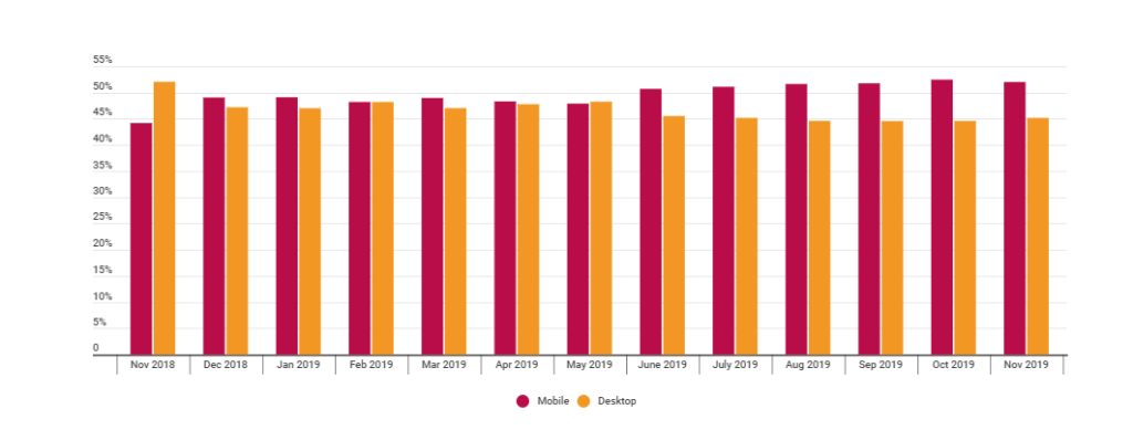
Yes, it’s true. Google weights responsive web composition better than the one that is not responsive. A few days back, the development team used to make separate sites for desktop and mobile phones. It was the time when cell phones weren’t necessary items. It was just used for the direct calls, that’s it. But today it has wide use. There are approximately 5.20 billion mobile users around the world.
However, prior when development was done separately, it was not a genuinely positive methodology. It brought upkeep costs through the rooftop, meaning the price was rising. Also, taking care of different sites and dealing with the SEO for every one of them was somewhere a hectic task.
Responsive Web Design- Let Your Design Fix In All Types of Viewports.
How to Use ‘Responsive Web Design’?
There are mainly three components of responsive web design include:
- Fluid Grids: This methodology is entirely based on ‘relative estimating’ or ‘resizing.’ This means to resize the content to fit the screen. Here you can use CSS rather than pixels for pictures.
- Media Queries: Media Queries permit the site to distinguish your viewports and fit the page onto the screen. This means the page will ultimately get changes as the screen size changes or the screen is extended.
- Flexible Visual: This element utilizes scaling or CSS to have pictures load contrastingly, relying upon the screen size.
Further, a responsive website composition gives the proper displaying of content on different viewports. It prevents blurring or pixelation of pictures, content dissipating over the page, and the undesired impacts of looking around the screen for perusing or survey the webpage. Besides, it adjusts to the screen size and changes itself in like manner.
Why Should Companies Dow Down Towards Responsive Website Design?
Responsive websites are an unquestionable requirement for any startups, SME’s, and big companies. This is all about giving the best to their potential customers.
A responsive site will convey the best client experience overall gadgets and has numerous different favorable circumstances. If you are as yet uncertain if you ought to go responsive, here are ten preferences of responsive website composition that may influence your choice:
1. Boost Search Engine Ranking

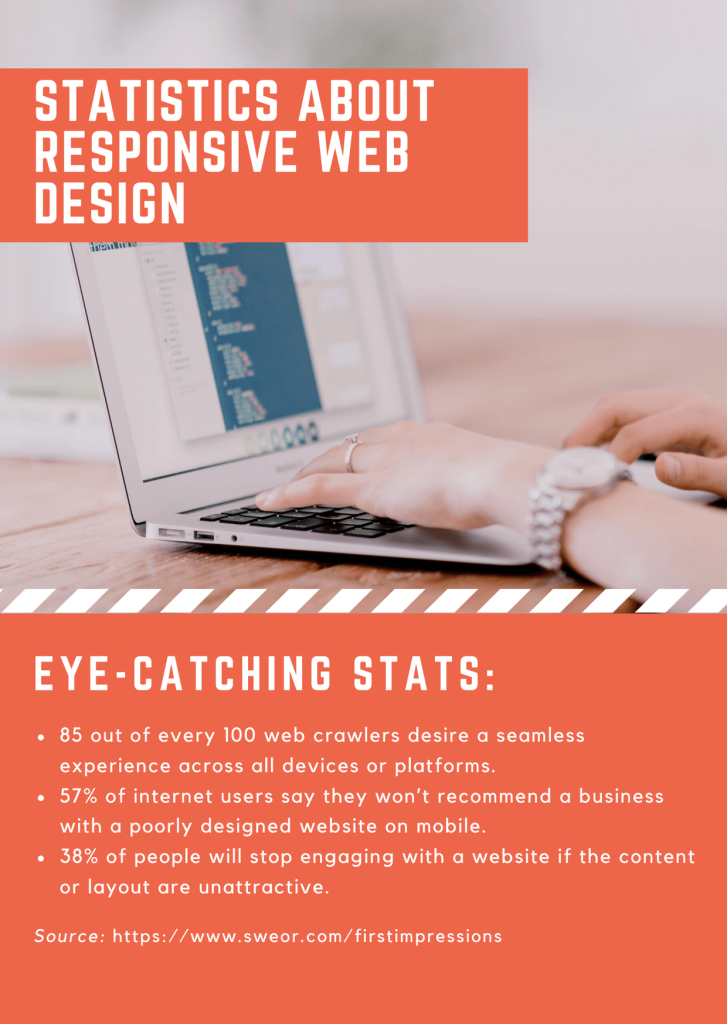
The best thing you can achieve with a responsive web design is an incredible improvement in SEO practices. This specifies the better ranking of your website. It acts as a critical factor for Google to analyze that your site is of good quality. As per the Google guideline, if your web page does not show the responsiveness, your site is lacking and ultimately falls down your SEO ranking.
2. Enhanced User Experience
If you want to build a positive thought on the visitors, the site’s responsiveness is necessary. Regardless of what type of devices your visitor is using, your goal is to provide a quality user experience. The user finds those websites attractive that give a proper response on clicks or to resize the screen. If you lack at this portion, then your visitor skips using your website. Moreover, if navigation and zooming of content are not right at their place, then it’s clear they will leave your page.
3. The Ultimate Increment In The Traffic

A recent study has found that 79% of website traffic is mostly from mobile devices. This hints at how it is progressively imperative to have a site that renders appropriately on every smartphone. Ensure you are focusing on a responsive plan; you will naturally see an expansion in your site traffic. Furthermore, there are great chances that they will stay for a longer duration on your site.
4. Quick Loading of Websites
People will come from those sites that take over three seconds to complete the loading content process as per insights. The sites that have a responsive plan will, in general, load a lot quicker. Since they work with optimized images and content, it encourages quicker loading of pages. The optimization of the content provides an immediate positive effect on the visitors of your site.
5. Huge Conversion Rates
Exploration shows that the average Smartphone transformation rates are around 64 percent higher than desktop. From this, it is effortless to perceive any reason why making a responsive site with a decent client experience is the way to a higher conversion rate. As your visitors invest more energy in your site, they assemble trust, prompting better conversion rates.
6. Makes Website Analytics Simpler
The most proficient method to improve your site is to have website analysis. The analysis helps you to realize how your clients communicate with your site. When you have two distinct forms for your site, it implies that your web analytics engineers will have various options and sidetracks to know the effective working of the site. It becomes convenient to examine where your traffic is coming from and how your guests collaborate with your element. This also helps in having an accurate report of your site.
7. Rapid The Web Development Processes
Prior, it was a typical practice for site owners to make a different mobile version as well as a desktop version site. Not only this, but it was also challenging to design a website whenever a more modest screen size was distinguished. In any case, making one responsive site takes less time and less money than making a standard site for distinguishing devices. In short, it will cost you additionally making two separate sites contrasted with planning only one responsive one.
8. Manageable Maintenance
Having a different desktop and mobile site requires extra testing and backing. At the point when you have two distinct renditions of your site, your development group will need to separate time and assets to oversee them viably. However, with a responsive site, your team will invest less energy in support and have more opportunity to focus on other significant tasks like promoting.
9. Reduce Bounce Rates
While talking about the site’s bounce rate, it indicates the level of visitors that skip the site just having a view at a single page. Since a responsive site gives an exceptionally improved client experience, your site visitors will experience no difficulty remaining on your site for more extended periods. When they stay for a longer time, they will be tempted to make some clicks on the sites.
10. Pull a wider audience
Responsiveness on-site pulls your audience to stay for more extended periods as you are giving access to a variety of different devices in all shapes and sizes. The design process will allow the accommodation of content no matter how big or small their screen is.
Now it’s time to see some responsive web design examples

Moreover, you have seen the various benefits of having a responsive website design. Now, look at some of its incredible examples.
- Dropbox
- Dribbble
- GitHub
- Klientboost
- Magic Leap
- Shopify
- Smashing Magazine
- Slack
- Treehouse
- WillowTree
Responsive Website- The Ultimate Approach To Enhance Visibility and Credibility of the site.
Wrapping The Things!
Although people are switching the way of accessing web pages, most people prefer the use of mobile instead of using the desktop. Nowadays, web pages are mostly accessible on mobile phones.
If your websites are not responsive, then it is high time to invest your time and money in making a responsive website. However, we have discussed the web design tips and why you should redesign your website to be responsive. Doing this will help you manage your website and increase traffic, conversion rates, website ranking, and much more.
Frequently Asked Questions
Q1: What does responsive web design mean?
A1: Responsive web design is an excellent choice for a web development project that makes dynamic changes to a site’s presence. This allows resizing the site’s content depending upon the screen size and direction of the gadget being employed to see it. In a responsive plan, page components reshuffle as per the size of viewports.
Q2: Who are the best responsive web design companies in India?
A2: In response to the best responsive web design companies in India, here the list:
- PixelCrayons
- Valuecoders
- 01Synergy
- OpenXcell
- TRL IT Solutions
Q3: How much does a responsive web design service cost?
A3: With the experience, I can suggest a responsive web design service would cost < $25/hr. However, the cost may differ for different companies you are hiring for the development process. Plus, the project’s size, the number of people involved, and adding the features reflect the web’s cost. If you are looking to outsource a web development project in India, then you must reach PixelCrayons. One of the renowned names in software development companies in India offering quality services at an affordable price.