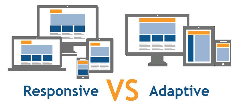
With the increase in the use of mobile phones by consumers, one of the biggest debates that webmasters are having is whether to use a responsive or adaptive design while building websites.
Ever since Google has announced in 2015 that it will rank mobile-friendly sites higher, people have been focusing on responsive web design more.
However, it is to be noted that Google did not specifically mention that you have to use responsive design. It just mentioned that a site should be accessible on mobile and have great UX and performance.
Keeping that in mind, you will have to consider both responsive and adaptive design while building your site. Of course, in the end, the choice will be yours, depending on your needs and goals.
Unless you are an expert, it is difficult to differentiate between responsive and adaptive design websites as they are very similar. Both designs adjust the website’s UI depending on the browser window’s width. It is the process in which they adjust is what differentiates them.
Let’s dig deeper into responsive and adaptive designs so that you can decide which one to implement while designing your site.
Highlights of Contents
What is Responsive Design?
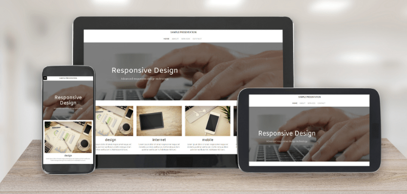
First coined by Ethan Marcotte, a web designer, and developer, in his book, Responsive Web Design, the term Responsive Design can be defined as an approach to creating web pages that use flexible layouts, images, and cascading style sheet media queries.
A responsive website detects the screen size and orientation of the visitor and modifies the layout accordingly. It will respond to changes in the width of the browser by correcting the placement of design elements so that it fits the available space.
The content will be shown based on the available browser space. On desktops, when you alter the browser window’s size, the content will change dynamically and arrange itself to fit the browser window. On mobile screens, the site automatically checks for the available space and then arranges the content itself.
What is Adaptive Design?
The adaptive design was introduced in 2011 by Aaron Gustafson, a web designer, in his book, Adaptive Web Design: Crafting Rich Experiences with Progressive Enhancement. Adaptive web design refers to a graphical UI design that adapts to varied sizes of screen.
When it comes to adaptive design, it has numerous fixed layout sizes. When you open the browser on a desktop, the website will detect the available space and pick the layout most suitable for the desktop screen.
The layout presented on a mobile site implementing adaptive design might be dissimilar from the desktop’s version. It happens when designers pick a different layout for the mobile’s screen instead of leaving it to rearrange itself automatically.
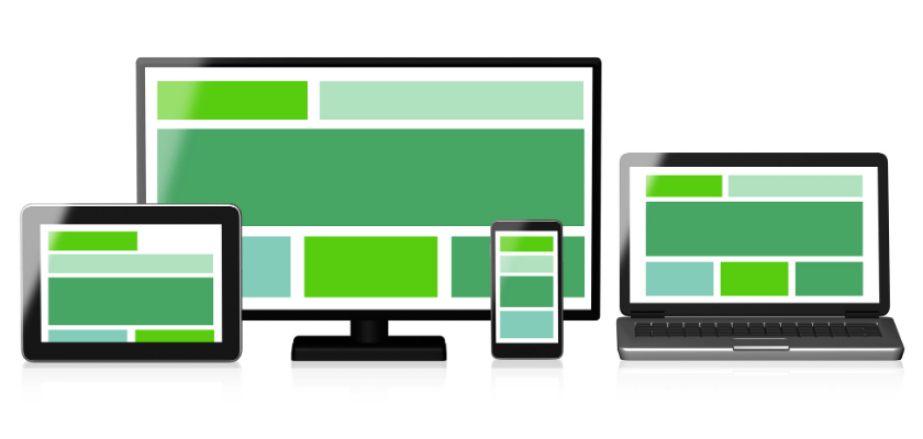
Main Differences Between Adaptive and Responsive Design
So, what are the main differences between responsive and adaptive design?
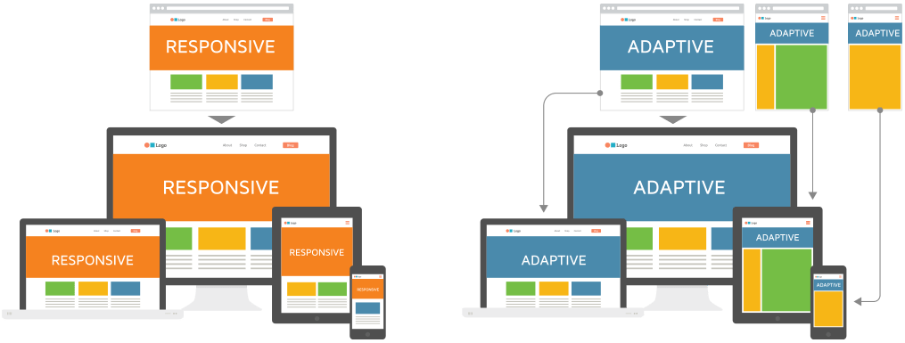
Responsive design is fluid. It adapts to the screen size regardless of the target device. The responsive design implements CSS media queries to alter styles based on the device, such as display type, height, and so on.
Just look at how Starbucks implements a responsive design. The layout used is single but how it places the web elements alters from desktop to mobile.
Adaptive design makes use of static layouts based on breakpoints. They don’t respond when they’re initially loaded. The adaptive website detects the size of the screen and loads the best layout for it. Designers usually design an adaptive site for six common screen widths- 320, 480, 760, 960, 1200, and 1600.
Like in responsive design, adaptive design sites also use the CSS media queries, but they also include JavaScript-based enhancements. It enables them to alter the site’s HTML markup depending on the capability of the device.
Just have a look at Amazon’s adaptive design website that allows visitors to use the full site functionality of the desktop version.
You might think that adaptive design requires more work as it needs designing the layouts for at least six widths, but in reality, responsive designs can be more complex. If you use media queries incorrectly in responsive design, it can cause display and performance issues.
Responsive Vs. Adaptive Design: Comparison
Having a look at the main components of both designs will make comparisons easier.
1. Layout
A responsive design site’s layout is made based on the browser window of the site visitor.
In adaptive design, the layout is made based on the back-end. Templates will be produced that are unique to every kind of device. Factors like device type and operating system are detected by the server, and the best layout is sent.
2. Loading Speed
Usually, adaptive design has a faster loading speed because it only sends essential assets specific to each device. For instance, when a user visits an adaptive site on a superior quality display, the images adjust to load faster based on the end user’s display.
However, responsive design can load faster, too, in some cases. Here’s an example. Webflow’s feature for responsive images can push both static and dynamic images to automatically fit any kind of device size and resolution.
3. Difficulty
Some designers argue that the task of building an adaptive design is more challenging as it requires varied layouts for different devices. In comparison, you need only one layout while building a responsive design.
However, note that though responsive designs may have one layout, you will need to invest more effort and time in building it. It demands extra attention to the CSS and organization of your site to ensure its functionality on any screen size.
4. Flexibility
Adaptive design is less flexible as if a user visits your site from a device with a screen size you didn’t design for, you will be required to edit an old layout or include a new one. Moreover, screen sizes keep altering.
A responsive layout, on the other hand, needs less maintenance. They are flexible enough to function on their own regardless of the device or screen size.
5. SEO Friendliness
Since Google recommends and rewards sites that implement responsive design, adaptive design sites can be difficult to rank as compared to responsive sites. You can consider taking the help of an SEO agency to carry out a successful SEO campaign.
Pros of Responsive Design
The pros of responsive design include:
1. Stellar Experience
No matter which device the visitors use, they will receive the same stellar experience. Thus, it breeds familiarity and trust.
2. Lower Maintenance
Since there is no need to create different content for different devices, it cuts out engineering or maintenance time. You can use the time for performing other important tasks like A/B testing, creating content, marketing, and so on.
3. More Budget-Friendly
You can set up a responsive design site and implement it quickly as it doesn’t demand an additional mobile site. It cuts out the development, support, and maintenance cost that comes with developing stand-alone mobile sites.
4. Boost Crawling and Indexing Efficiency
When you have a responsive website, a single web spider will crawl your page once. Thus, it boosts the crawling efficiency. It also encourages search engines to index more of the content on your site.
5. More Search Engine Friendly
Google recommends mobile-friendly websites. Thus, responsive websites have an advantage here. Just ensure that your responsive websites are mobile-friendly.
Cons of Responsive Design
Responsive web design has drawbacks, some of which are listed below:
1. Slower Loading Time
Since a responsive site loads the information for all devices, its loading time is slow.
2. Difficulty Integrating Ads
It is difficult to integrate ads effectively with responsive sites as ads have to accommodate all resolutions. They may not configure properly.
Pros of Adaptive Design
The pros of choosing an adaptive design include:
1. Optimizes the Experience for Each User
Since adaptive design optimizes the experience for individual devices, each visitor gets a seamless user experience. Content can be adjusted by targeting things like the visitor’s location and network connectivity speed.
2. Faster Load Times
Since it will load only the version of the site visitors require, the page load speed becomes a little faster, especially for smartphone users.
3. Optimized for Ads
You can optimize ads based on the user data from devices of smaller screens.
Cons of Adaptive Design
Some cons of adaptive web design include:
1. Difficult to Create
Adaptive design requires more effort, as there are a lot of technical aspects to consider.
2. High Maintenance
You need to update multiple versions of the website individually, making it harder and more time consuming to maintain the site.
3. Expensive
Because adaptive web design demands a big team of developers to handle the complexity of building and maintaining, you will be spending more.
Who Should Use Responsive Design?
Opt for Responsive Design if:
- You are a small to medium-sized company and need to update your existing sites.
- You are new businesses in need of a brand-new site.
- You are a service-based company. You will be using a lot of text and images.
- You need a fully functional site for a budget-friendly price.
Who Should Use Adaptive Design?
Opt for Adaptive Design if:
- You have existing complex websites that need a mobile version.
- Your site is speed-dependent.
- You need to offer a highly targeted experience.
- You need more control over how your site is delivered to varied users across different devices.
Final Thoughts
As everything is made clear, you can choose to design a responsive or adaptive site depending on your needs, goals, and budget.
Go for responsive design if you’re looking for a cost-effective and easy way to build a highly functional website that offers a seamless experience. The adaptive design will be a better option if you want to offer a more customized and target user experience.
Frequently Asked Questions (FAQs)
Q1: What is the difference between responsive and adaptive design?
A1: The main difference lies in that while responsive design is fluid and adapts to the screen size regardless of the target device, the adaptive design uses static layouts based on breakpoints.
Q2: When to use responsive design?
A2: You should use responsive design to rank higher on search engines and to offer a seamless experience to your users.
Q3: When to use the adaptive design?
A3: You should use adaptive design if you want fast loading page time and offer a highly targeted experience.